The group I draw Friday night portraits with is featured in coolcleveland.com. My drawing for Bella was featured in the article.
http://www.coolcleveland.com/blog/2012/01/pretentious-tremont-artists/
1.11.2012
1.10.2012

1.07.2012


12.06.2011


11.13.2011

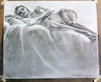
11.08.2011
Friday night portrait
Was so focused on the face, only now I realized how disproportionate the head is compare to the shoulder. Live and learn.


10.27.2011


9.16.2011

9.10.2011


8.14.2011


7.30.2011

7.16.2011

7.02.2011

6.26.2011


6.11.2011
Literary Sketch
This one turns out to be quite a disaster, first the color, then the proportion. Live and learn...
Medium: Watercolor

Medium: Watercolor

5.21.2011
Saturday Life Drawing
In the past, it seems all the mediums I tried are pretty easy to handle. Whether it's watercolor, oil pastel, oil painting or digital paintings, I was able to just pick one up and use it without much of a struggle. Recently, I realized not all mediums behave the same (duh!). Conte and dry pastels are two that I struggled to get used to. They don't respond to pressure the same way, they don't blend the same way, and they are hell of a mess.
Oh well, next time I'll try them with a dry brush instead.
Pastel. 3hr
Oh well, next time I'll try them with a dry brush instead.
Pastel. 3hr


5.17.2011
More detailed sketches and more common sense
I'm always aware that I need to put down more details in the initial sketch, to make the coloring easier, and to avoid forgetting certain things later. I had always kept that in mind when I'm sketching a character, and completely ignored it for landscape. And now I'm being reminded why a better detailed sketch is important.
My common sense starts to kick in as I lay down the darker shades:
1. Who mows the lawn on these hills? no one. So instead of little grass blades that barely cover a person's ankle, I really should be drawing tall grass instead. Fortunately this was relatively easy to fix.
2. Watch the wind... yeah, the smoke is blown to the right, yet the grass stands tall and still. It's not so easy to fix this mistake now, I guess I'll just have to go with the excuse: wind is stronger on top of the hill.


Subscribe to:
Posts (Atom)